Responsive Web Design
Summary
Responsive Web Design is an approach that emphasises design which works well across a variety of devices and browsing contexts – without serving different content for each different operating system, device, browser, display size or pixel density.
Responsive Web Design (RWD for short) is an approach that emphasises design which works well across a variety of devices and browsing contexts – without serving different content for each different operating system, device, browser, display size or pixel density.
Ethan Marcotte’s article for A List Apart
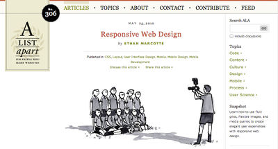
The term was coined by Ethan Marcotte in an article on A List Apart, who suggested three methods to cope with different browser window sizes:
- Fluid grids (layout that adjusts to fit the viewport)
- Flexible images (images that adjust to fit)
- CSS Media Queries
To get a sense of what RWD means it’s best to see it in action. There are lots of examples of sites using responsive design at mediaqueri.es: open the sites listed on mediaqueri.es in a desktop browser and try resizing the browser window.
Earlier web designers had discovered the advantages of separating content from layout as well as using liquid layout and hybrid techniques as opposed to static, ‘pixel perfect’ attempts to mimic Photoshop and print media. As John Allsopp wrote in The Dao of Web Design: ‘Now is the time for the medium of the web to outgrow its origins in the printed page.’
Jared Ponchot points out that the web was by it’s very nature designed to be responsive.
The perils of serving different content
Smashing Mobile Book

Maintaining a parallel ‘mdot’ website for mobile platforms – for example, serving m.webplatform.org to mobile devices and www.webplatform.org to desktop browsers – can incur significant overheads for code management, content synchronisation and hosting infrastructure.
Even if you only have one site, but you serve different content to different devices, you always risk alienating someone. Trent Walton gives a good example of this in the Smashing Mobile Book: his favourite news website removed the pollen report from its mobile version, which was the information that meant most to him. The moral of this tale is: best not to guess what content or features your users won’t miss.
Consistent content is king! Responsive design can be used to give all your users access to all your site’s or app’s content and features.
Workflow and process
Responsive Comping article by Matt Griffin
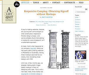
For RWD to work, everyone involved in the production process must collaborate, including designers, coders, writers, illustrators and business managers. Different workers have may have different skills, but good design has to be holistic.
Web content is consumed via an increasing variety of software and hardware, with different display sizes, input methods and usage contexts. This means that style guides should avoid fixed sizes and positioning. Trent Walton refers to this new way of method of design as 'a network of content that can be rearranged at any screen size to best convey the message’.
A simple way to start on responsive design is to ensure that design begins with ‘lo-fi’ mockups and benefits from discount usability testing. There are lots oftools to help achieve this. (Other prototyping tools include Ratchet and Foundation.) Applications such as Balsamiq Mockups make it possible to quickly try out interface ideas, without producing pixel perfect printouts that would encourage static designs.
Developer Brad Frost has compiled a list of resources for implementing a responsive design process.
To make RWD possible in a commercial context, it is crucial to be able to get sign-off for responsive designs: Matt Griffin has suggestions on how to achieve this in his article about what he calls responsive comping.
Layout, sizing and grids
Viewport
There are two types of width specified in the context of browser display space:
device-width: the width of the display (the ‘desktop’)width: the width of the browser viewport.
However, most smartphone browsers actually use a nominal display ‘viewport’ which is wider than the width of the device, and set width to be the width of the viewport. In other words, the browser displays web content in a ‘window’ that may be wider than the actual device, and the user can then swipe or zoom to navigate between on- and off-screen web page content. This is done to ensure that unresponsive sites aren’t crammed into the device width, which is a sensible compromise, but can cause problems for responsive design since it means that the device size doesn’t correspond to the virtual viewport size.
To get around this, Apple devised a simple solution: the viewport meta element:
<meta name="viewport" content="width=device-width, initial-scale=1.0, minimum-scale=1.0">
This example causes width to equal device-width: the ‘window’ that web content is displayed in has the same dimensions as the actual display. (The scale values refer to zoom level.)
A comprehensive guide to the viewport meta element is available on the Mozilla Developer Network, and there are a number of tools for viewport testing.
Dimensions and units
A pixel is not a pixel
One of the major problems with using px (pixel) units on mobile devices is that a ‘CSS pixel’ (the unit used in a CSS rule) may not correspond to a ‘device pixel’ (the actual coloured dot on the display). This number of device pixels per unit of physical width is referred to as pixel density. (To determine the appropriate resolution for an image in a given context, the browser uses the device pixel ratio, as described in Boris Smus’s article about high-DPI images explains the meaning of device pixel ratio.)
A diagram showing one reference angular pixel, to help illustrate how devicePixelRatio is calculated
![]()
Browser vendors such as Apple and Mozilla found that sites displayed poorly on high-resolution devices (i.e. those with a high density of physical pixels) if browsers kept to a one-to-one ratio between CSS pixels and device pixels. As a result, this ratio varies across browsers and platforms.
This means that, unlike for print media, it is not advisable to attempt to specify absolute (physical) size for text, images or layout on the web. Peter Paul Koch has written a very detailed guide to this problem. Zoom compounds the situation: for more information, see High DPI sites on the Surfin’ Safari blog, and the Quirksmode post, A tale of two viewports.
As a result, one of the core techniques of responsive design is to use relative, not absolute units, and techniques for this are described throughout Koch’s article.
Media queries
CSS media queries allow you to choose different CSS rules for different browsing conditions, such as media (print or screen), display width or device orientation. Media queries are at the core of RWD approaches, because they enable web designers to specify different layouts and sizes for different contexts.
You can use media queries to apply different stylesheets:
<link rel='stylesheet' media='screen and (min-width: 400px) and (max-width: 800px)' href='css/smallish.css' />
…or different rules:
@media all and (min-width: 300px) and (max-width: 600px) {
  header {
    background-image: url(bg_small.png);
    padding: 0.5em;
  }
}
mediaqueri.es provides examples of sites that use media queries, Mozilla Developer Network provides a detailed reference to media queries, and more details of features that may be implemented in the future are available from the W3C Recommendation.
Breakpoints
mediaqueri.es site
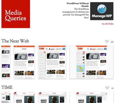
‘Breakpoint’ is CSS-speak for the dimensions at which a different sets of style rules should be applied. Layout are liable to ‘break’ at particular sizes: for example, two 350px-wide images side by side with no padding or margin might overlap horizontally when the width of the viewport goes below 700px.
There are two ways to work out breakpoints:
- By device size, using common dimensions for (say) phones, tablets, laptops and larger screens.
- Based on content, adding breakpoints at dimensions that make sense for your layouts.
The problem with the device-size approach is that the number of device types and sizes is continually changing, and boundaries are getting blurred. This makes it hard to maintain the ‘right’ device-oriented breakpoints. In general it may make more sense to add breakpoints to suit content, so layouts don’t ‘break’ no matter what size the screen.
It’s easy to test this out, with tools like Remy Sharp’s responsivepx and Brad Frost’s ish.
Responsive design v Adaptive design v adaptive layout
Adaptive web design can respond to varying contexts without fluid grids and flexible images, for example by providing different page components in different contexts. Brad Frost gives three examples of design that is adaptive rather than responsive:
Can this device access my location? If so, inject a Use Current Location button onto the site in addition to the basic store-finder form.
Does this device understand touch events? If so, make this image carousel swipeable in addition to the previous and next buttons.
Does the browser support HTML5 canvas? If so, replace this static image with a canvas element.
For typography, images and layout, adaptive design might respond to breakpoints in a way that is not 'responsive’: for example, by using fixed measures rather than fluid grids.
‘Adaptive design’ also refers more generally to the idea of progressive enhancement: for example, providing location-based functionality for a web app on mobile devices, but not on the desktop.
The differences between ‘adaptive’ and ‘responsive’ have been summarised by Aaron Gustafson, often credited with inventing the term 'adaptive design’. Marc ven den Dobbelsteen also used the term ‘adaptive design’ in his 2006 Switch McLayout article. Brad Frost has suggested that responsive design is a subset of adaptive design.
More information
Using media queries on mobile platforms: http://mobile.smashingmagazine.com/2010/07/19/how-to-use-css3-media-queries-to-create-a-mobile-version-of-your-website/
Reference: developer.mozilla.org/en-US/docs/CSS/Media_queries
W3C Recommendation: w3.org/TR/css3-mediaqueries
Testing
Remy Sharp’s responsivepx tool
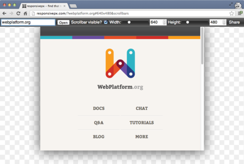
For responsive design to work well, it is especially important to test sites and applications at different viewport sizes.
Remy Sharp’s responsivepx makes it possible to adjust viewport width and height values, in order to find the breakpoints at which responsive layouts need to change.
Brad Frost’s ish resizer

Brad Frost’s ish resizer emphasises that breakpoints should be based on content rather than nominal device dimensions.
For responsive typography, designers have found that body text should generally have between 45 and 75 characters per line. A simple trick for testing layouts suggested by Trent Walton, is to add an asterisk to lorem text after 45 and 75 characters. If both asterisks appear on the same line at a particular viewport width, the font size needs to be changed.
A huge range of other tools is available for testing and debugging responsive design components including images, fonts and layouts. For more information and resources see the Mobile Debugging article on webplatform.org.
Pro and con
A word of warning: ‘pure’ RWD may not always be appropriate, and developers such as Guy Podjarny have pointed to potential performance problems.
In 5 Reasons Why Responsive Design Is Not Worth It Tom Ewer argues that RWD is simply a waste of time and money given that modern mobile browsers are designed to cope well with non-responsive sites (for example, by zooming elements to full width when they’re tapped on). Ewer also suggests that providing different layouts for different browsing contexts is confusing to users.
Developers have encountered several other RWD hazards:
- Embedded components such as maps or games may not translate well to responsive designs
- Users may prefer the ‘swipe and zoom’ approach: getting a visual overview of a site, then zooming in to what interests them
- Providing different site layouts on different platforms might surprise users – reducing trust, recognition and consistency – even if site content is the same
- Website publishers need to monetize their sites and apps, and many ads are not responsive.
- Many developers have to work with existing code and content, and cannot not start from scratch. In this case hybrid approaches may be a better bet.
- Older browsers do not support media queries, CSS properties such as
max-widthand may not even support techniques such as relative sizing (or even have good support for fixed sizing). This can be a particular problem for the significant minority of browsers on low-end cellphones.
Some techniques for dealing with these issues are described below.
Coping with older browsers
Media queries
Scott Jehl’s Respond.js polyfill enables min-width and max-width rules, even with older browsers such as Internet Explorer 6 8; jQuery likewise.
Feature detection
The Modernizr library works on most web platforms and can be used to build responsive sites and apps which work in a range of contexts.
Polyfills
A polyfill (think Polyfilla) is code that enables features to be used natively, if they’re available, or replicates them if they’re not. This can be very useful for achieving future-proof RWD across a range of browsers.
High performance RWD
Several developers have suggested techniques to avoid or minimise performance problems with RWD.
Guy Podjarny: Responsive Web Design Makes It Hard To Be Fast and Performance Implications of Mobile Design
Jason Grigsby: The Performance Implications of Responsive Web Design
Brad Frost: list of RWD performance resources
RWD opt out
Bruce Lawson blog post: opting out of RWD
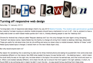
Bruce Lawson and other developers have suggested that it might be appropriate to give users the option to opt out of RWD: his blog post on the subject, has links to articles explaining techniques for enabling this.
Further reading
Responsive Web Design, by Ethan Marcotte
This is Responsive: patterns, resources and news collated by Brad Frost
The Dao of Web Design: influential article by John Allsopp from April 2000: ‘Now is the time for the medium of the web to outgrow its origins in the printed page.’
A List Apart articles on responsive design
Related concepts
Adaptive web design
See also
Related articles
CSS Layout
Responsive Web Design
Grid Layout
Responsive Web Design